Failure Disguised as Success
What if you thought your marketing was succeeding when it was really failing? This was the case with Autodesk, a technology company that makes high-end design software that architects, designers, and engineers use to design houses, bridges, cars, and more.
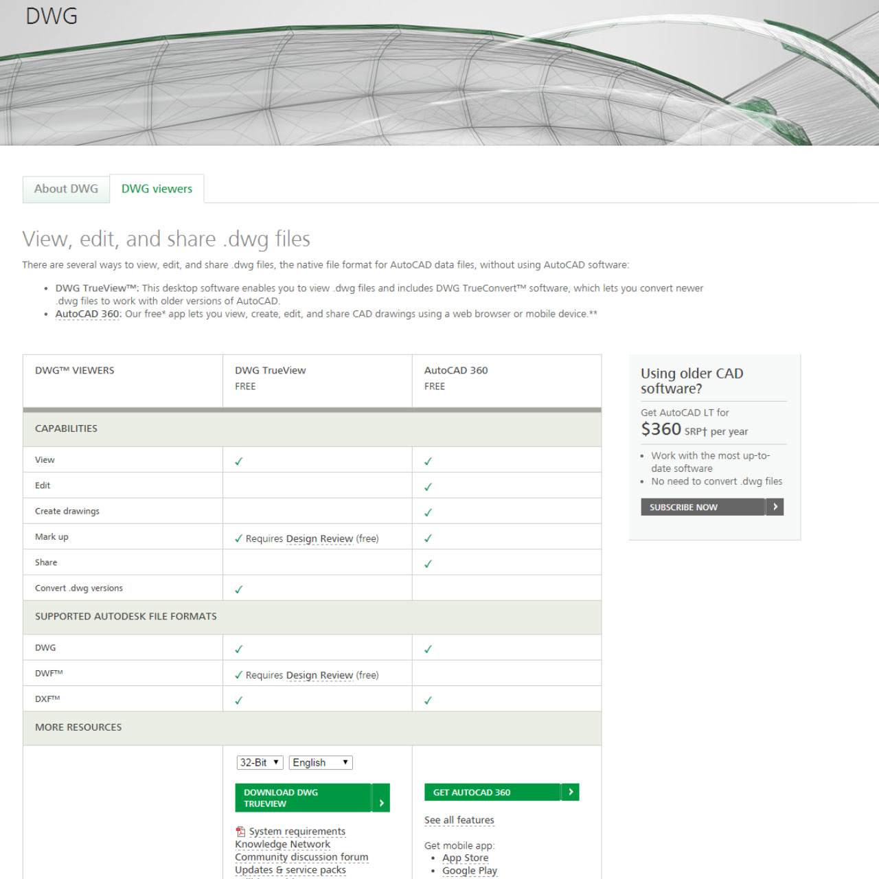
In a design or engineering practice, there are those who create the design files (DWG) such as an architect and those who need to view the files, but don’t need access to the design software, such as the contractor. Each year, more than 7 million people came to Autodesk looking for help simply viewing design files so they could get their jobs done.
In fact, the page on Autodesk’s global website that offered free DWG viewers was the second most visited page. Eighty-five percent of the traffic to it came from outside the U.S., creating a perception that global awareness was high.
Considering these stats, it’s understandable that the marketers viewed the DWG page as a success. But when we took a closer look, this wasn’t the case. The visitors to the DWG page saw things quite differently: The information was confusing and the options unclear. A deeper dive into the data showed that only one in five customers successfully downloaded the viewer.
Additionally, the international traffic was largely due to customers being unable to get the answers they needed on their local country websites, which meant the sites were failing to do their job.

A Customer-First Agenda
To develop a solution that would help customers be more successful in their task, we set aside the marketing agenda and got curious about the customer’s agenda. We conducted one-on-one interviews with customers to better understand their work in context, such as:
- How they used the design files and technical issues they encountered while trying to do so.
- The information they needed to navigate their viewing options: Did they just need to view the file? Convert the file to a different format? Annotate the designs?
- The unique challenges for visitors coming to the web page from other countries.
We also discovered that some visitors were using the DWG viewers as a workaround for outdated software due to budget constraints.
With this new knowledge and empathy for the customer, the customer-first approach became clear: We needed new content that explained the purpose of DWG files, provided clear descriptions of the various solutions, and offered an easy way to compare the features of each option (which were best for reading, annotating, or converting).


We also reengineered how a customer downloaded the viewing software so it was easier and faster to install. Additionally, we created DWG pages for each of the local country websites to better serve international customers in their native language and for their nuanced needs. Over a four-week period, we tested four different versions of the page with customers through A/B testing and interviews until we landed on the magic formula.
↑300%
download success rate
↑20%
page traffic boost
↑92.5%
purchase
Small Changes, Big Impact
With these new improvements, significantly more customers were able to identify the right solution for them: Download success rates went up 300 percent, customer satisfaction scores for the page increased by 30 percent, and organic page traffic grew by 20 percent because Google gave the page a higher ranking. International traffic also decreased because customers were now finding what they needed on their local Autodesk websites.
“The website brought me straight to what I needed. The whole process took maybe 5 minutes. It was a great experience.”
– Autodesk Customer
Additionally, the improvements we made to the DWG page allowed us to share Autodesk’s new low-cost subscriptions for AutoCAD LT (“light”), which offered the current design software at a fraction of the price. AutoCAD LT was perfect for customers running outdated versions of the software because of budget constraints. As a result, visits to the AutoCAD LT e-store page went up 574 percent, and purchases by 92.5 percent.


